
The Sweet Spot
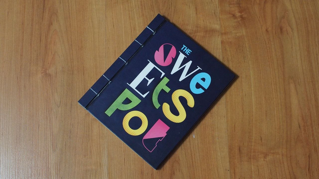
I created this variable typeface for my Final Year Project (FYP) for my Bachelor's at NTU ADM. It was made to advocate for context-driven design practice, where every creative work, no matter the field, must be tailor-made to fit it's context such that it effectively delivers it's message to it's target audience. You know what, you can just read my abstract:
What is art if it does not connect with its audience? What is design if it is not understood?
Far too often, artists and designers prioritise conceptualisation over understandability. This project investigates how creatives can navigate the “sweet spot” between conceptual complexity and audience comprehension. Using typography as a testing ground, it explores how visual intricacy in typefaces influences both enjoyment and legibility across varying audiences. The goal is to create a general framework through this case study that artists and designers can use to influence their own research and adapt to their own work.
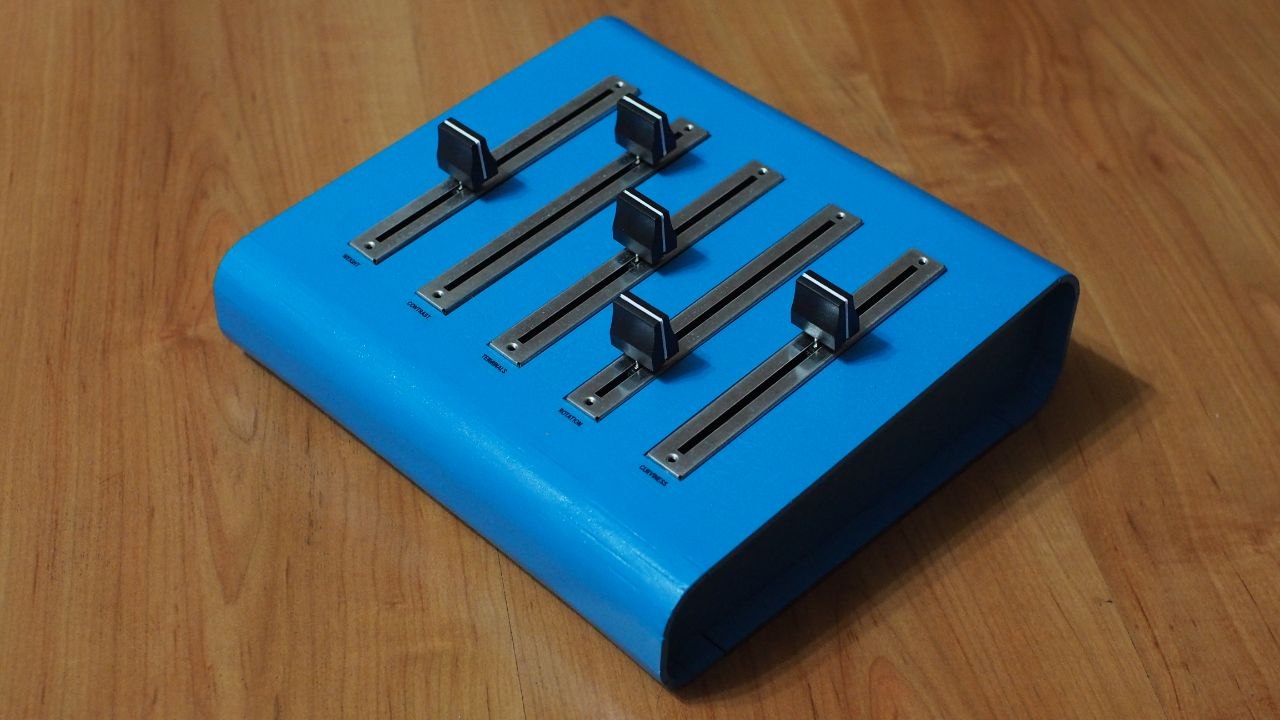
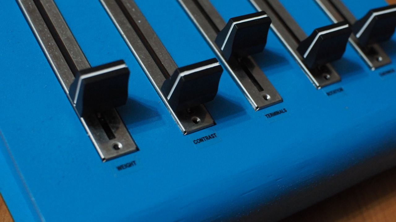
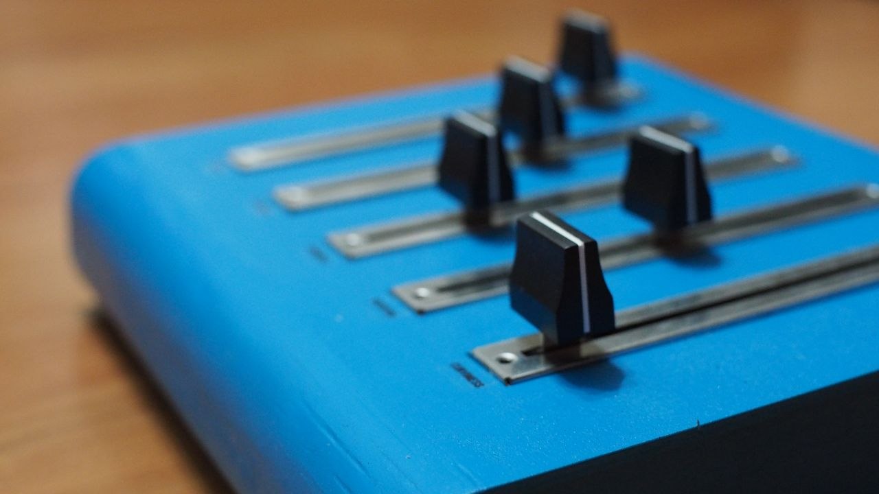
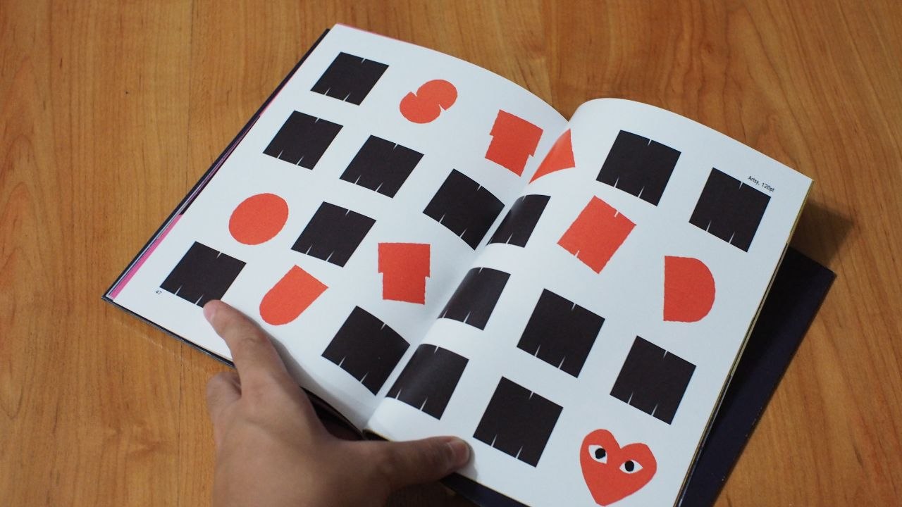
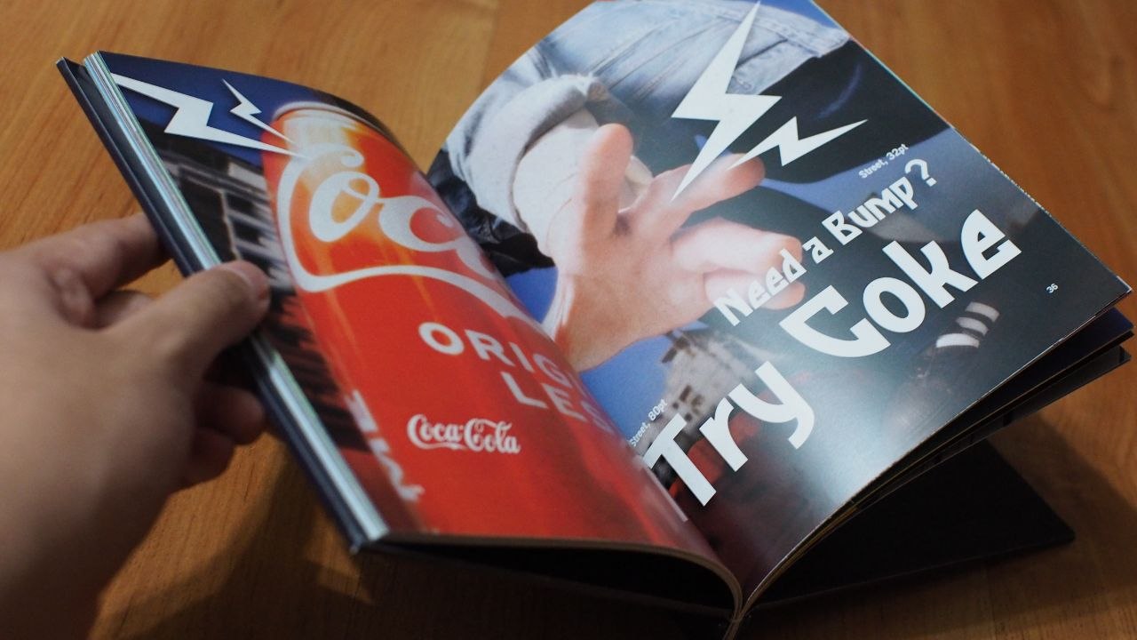
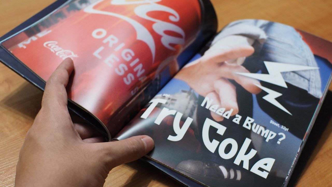
Basically, there are 5 axes (Weight, Contrast, Terminals, Rotation, Curviness) in this variable typeface, which can be adjusted to better suit the text's intended purpose. The axes can be adjusted to fit 5 "sweet spots" or vibes (Corporate, Luxurious, Street, Artsy, Welcoming).
Try it out here!